Unlocking Success: Implement these five strategic tweaks to improve the user experience for your state exchange.
In 2013, when state marketplaces first opened, we watched as nearly 80% of users encountered difficulties entering their income information, resulting in inaccurate eligibility determinations.
Over the past decade, we’ve closely observed users navigating the state health insurance enrollment process. During this period, several state exchanges have implemented subtle yet impactful changes that significantly enhanced the application experience. These modifications not only led to more successful enrollments but also contributed to a reduction in support costs.
Upon engaging with new state exchanges that haven’t undergone usability testing, we consistently identify recurring fundamental issues. We recognize the challenges faced by government-funded programs, including limited budgets for usability improvements, a shortage of designers, and bureaucratic obstacles. However, by implementing small yet strategic changes, we can bring about substantial improvements for a significant portion of the population.
We have identified the top 5 areas you can improve today, with the least effort, to reduce user frustration and facilitate successful enrollment.
70% of enrollment problems can be solved by improving five key areas.
#1 Remove irrelevant calls to action for returning users
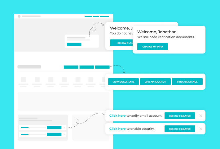
Missing tailored call-to-action for users.
When returning users login to their account page, they cannot quickly figure out where to find or compare plans. They click around and around and eventually get discouraged enough to call support, end up in anonymous browning viewing plans that don’t show pricing with financial credits, or decide to hold off on looking for insurance until later.
“I’m looking for something about signing up for a plan or enrolling. I’m not sure where to go from here.” – Returning User 2023

We see 90% of returning users experiencing this frustration.
If you can do one thing to improve the experience, do this! This is the first impression of your application and the most effortless update to make, as it does not require backend changes.
Add tailored call-to-action for returning users, and don’t over-stuff the account page with various links.
A new group of returning users has emerged in the last five years. This group comprises individuals who previously had insurance through the exchange, skipped one or more years, and have now returned to the exchange.
- This group, which is likely a larger share of your market, has had to adapt to the existing navigation structures.
- They are shown options renewing enrollees would understand, but that doesn’t fit the context of their situation.
- Users with incomplete applications never deleted from previous years are shown unrelatable calls-to-action.
- This group often clicks around until they find an option that looks correct.
Many marketplaces stuff the account page with links for all types of user needs rather than guiding and directing users based on the different pathways necessary for the context of their visit. The lack of context makes it harder for users to discern where to go.
To fix this, reorganize the account page so the critical calls-to-action are immediately accessible, then bucket the rest of the options.
#2 Connect plan pricing & financial assistance in anonymous browsing
Anonymous browsing does not show financial assistance as part of the monthly premium.
Many state insurance exchanges offer the opportunity to anonymously shop for plans and view pricing before filling out an application. Anonymous shopping is essential to users, but some exchanges don’t reflect the financial assistance users might get alongside the plan prices while anonymously shopping. Additionally, many users do not realize the financial assistance they might receive does not factor into the plan pricing shown when browsing anonymously.
This leads to an inability to get a complete picture of costs.
The ability to see the whole financial picture of plans for their household size and income is essential in making an educated decision. In some instances, users compare the plans and pricing of state exchange insurance against the cost of employer or private insurance. Filling out the whole application to get pricing that includes assistance can be very time-consuming. When we run tests on anonymous browsing, users spend more than an hour exploring plans and pricing that may not be available after filling out the application.
The lack of clarity about plan pricing in anonymous browsing leads to users incorrectly evaluating plans, wastes users’ time, and depletes their energy. Ensure that users are looking at plan prices that reflect their assistance.
#3 Focus on fixing the most impactful bugs & errors

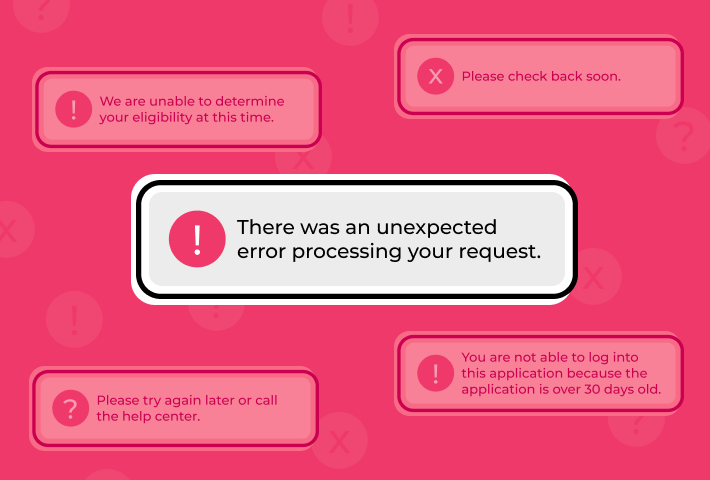
“There was an unexpected error processing your request.”
Errors like this one do not contain any contextual information to allow users to try and troubleshoot the issues in real-time.
This error, among others, shows up across multiple exchanges and still happens today. This has caused users to quit the application, sit for hours on hold with customer support, or end up having to reenter their information.
Additionally, current expectations for autosave are not being met. A best practice would be to record the information as users progress and have that autosave.
We understand that developers are consistently working on a long list of errors and bugs and that every exchange will have different types, but prioritize fixing the ones that happen repeatedly and that derail or halt progress because those have the most impact on the user’s experience.
#4 Make editing application information less rigid
Like other online shopping experiences where one may get stuck in the checkout process and be unable to get back to the cart to edit, state exchange users cannot make simple edits to their application quickly.
40% of people who want to edit one piece of information in their application end up clicking through irrelevant application areas first.
Although this does not happen as often as some other issues, it causes a high level of irritation.
Most people will not complete your application in one sitting. So it’s essential to accommodate a multi-session workflow. They need to be able to save and go back and edit where they left off quickly. If they notice something previously entered is incorrect, they should be able to jump to that area, make the fix, and then jump back to where they left off.
The natural tendency for users is to try and update the information on the screen they are viewing. However, in many cases, that’s not possible. Users must return to the beginning of the application to select which information they need to update. This derailment thwarts the process and can be most irritating for users.
Avoid making people start from the beginning when editing and allow for easy updating of information that doesn’t break the workflow.
#5 Reduce the complexity of entering income

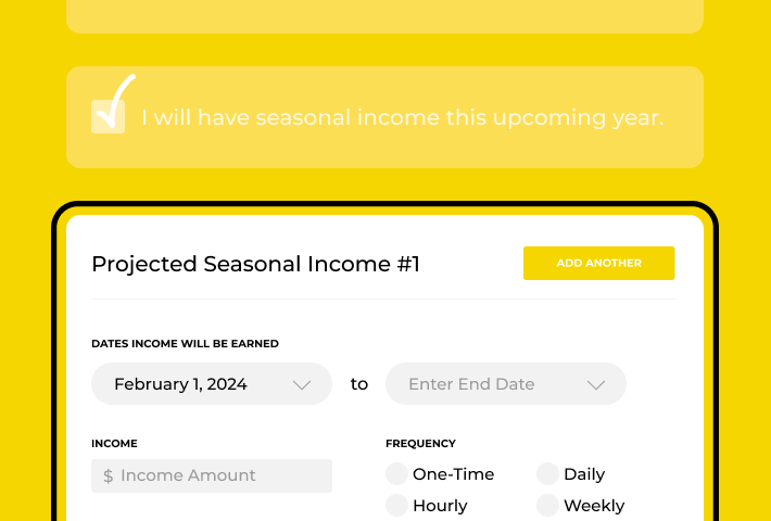
Income is an essential part of the application. The income is how the system will qualify someone for financial assistance. Most people looking for insurance through the marketplace count on this assistance to give them more affordable insurance options.
With most state exchanges, reporting income remains problematic and a critical issue within the application. We understand the many reasons for this complication and the various employment situations that can exist, making this application area challenging to improve.
Most people have an idea or ballpark of what their income might be. Ask for general income estimates to simplify the process. To further improve the process, use their verification documents to collect their employment data rather than ask the user to fill this in. This will reduce the burden on the user and likely lead to collecting more accurate income.
In summary, it’s time to improve.
The existing challenges impose substantial customer support costs on your organization and, more critically, place a significant burden on the citizens who depend on your website to secure essential health insurance for themselves and their families.
The extensive time users invest, often spanning hours or even days, in navigating the health insurance application process underscores the urgency for change. This process is frequently marked by high levels of stress and anxiety, with users grappling to comprehend and assess their options. In some instances, the emotional toll is so profound that the mere act of applying for and selecting insurance has been known to reduce users to tears. Addressing these issues is not just a matter of enhancement; it’s a crucial step toward fostering a more humane and user-centric experience for those seeking vital health coverage.
“Ugh, why is this so hard, it would be easier to quit my job and work somewhere to get insurance than do this.” – User 2022
Take the next step by assessing your exchange’s current status in light of the issues highlighted here, and initiate impactful changes, no matter how small. Following this, consider hiring an expert to evaluate your application, then couple that with qualitative research. This approach lets you observe users in real-time, gaining insights into their behavior and current circumstances. This holistic understanding will not only inform refinements but also set the stage for a more user-centered and effective state health insurance marketplace.
Contact gotoresearch if you want us to conduct an expert evaluation of your state exchange or in-depth qualitative research with your users.
About gotoresearch’s experience with state health insurance exchanges.
Since 2014, our UX Research agency, gotoresearch, has had the opportunity to conduct usability testing for Covered California, the first state health insurance marketplace, and for Healthcare.gov. Since then, our testing has expanded to other states, including Minnesota, Rhode Island, Massachusetts, and Maryland. In states where we had the chance to conduct iterative usability testing, we have observed significant improvements in the usability of their site and insurance applications over time.
We focused on understanding and identifying where users get derailed and experience challenges throughout the insurance exploration and enrollment process.
Your website serves various audiences and is the front door to your organization. You aim to have your citizens quickly navigate the application, easily input essential information in as few clicks as possible, and enroll in a plan. We help you ensure the process is smooth for your customers to reduce their time spent and, ultimately, customer support costs.
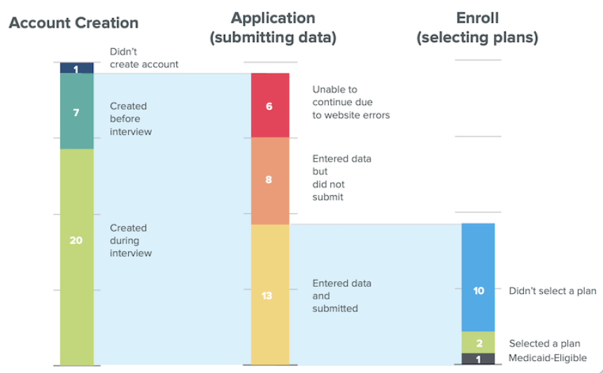
*The chart at the top shows enrollment data taken from a study with healthcare.gov in 2013.

