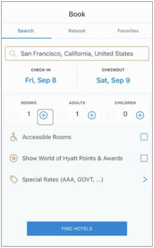
The order in which assistive technology reads information is crucial for users to navigate content effectively. In the following A11y App Review example, we’ll explore a situation where a blind user must depend on memory and context from other elements to discern what they are adjusting while booking a hotel room with Hyatt.

The Challenge:
Consider a scenario where a user tries to book a room with Hyatt. To accomplish this, they must specify the number of rooms, adults, and children for the reservation. However, the screen reader cycles through the headings (rooms, adults, and children) before moving on to the associated inputs. The lack of pairing between the headings and inputs means the user does not know which input they are adjusting. Consequently, they may select two rooms and one adult instead of 1 room and two adults.
Furthermore, without descriptive labels on the settings the user is adjusting, it’s hard to understand the adjustments and the current state.
Recommended Best Practice:
When dealing with forms or input areas in an application, ensure that the code follows an order that allows screen readers to read the field label and then the input sequentially. Additionally, consider putting all related input fields together by the fieldset elements. This facilitates user orientation and comprehension of the input fields.
Using descriptive text with each input reduces reliance on the user’s memory and reinforces the user’s selection. Lastly, the screen reader should announce the updated state when an input changes.

